
The time of the affordable e-ink is finally here. I’ve wanted a decent-sized e-ink screen for nearly a decade now - basically ever since I became interested in microelectronics back in 2016 - and in the year of the lord 2025, they are finally a reality. I nearly bought a TRMNL at the start of the year, and the project still looks quite good. But I’ve delayed major purchases for the first months of transitioning to freelance, and by the time I could confidently put down the money, the Pimoroni Inky Impression 13.3” had released and offered something that interested me much more.
A pure screen without an operating system and six colors! I could do anything I want, as long as I also do a lot of additional things, like managing my own rapberry pi, building a nice housing and managing batteries if I want it to operate cordless (the TRMNL claims 2-6 months of operating time. My single attempt to run my screen from a thin external battery died in less than 48 hours. I have not tried it since.)
But the display capabilities give me a nice warm buzz. Something about it makes a lot of mundane graphics look very cool to my eyes, and I’m excited to get an easy outlet to push more things that I like into the faces of the people that visit my home. The general plan is that the display will be purely decorative, featuring things such as cool art, comics strips and jokes (XKCD should be a gold mine for this), album art (taken from spotify based on what’s currently playing) and more.
One of these “and more” is the thing I’ve implemented over the past two days: quotes and text snippets, to be easily added by myself or any visitor. From song lyrics to party bloopers, the possibilities for this are obvious and endless.
I wanted my visitors to have a very low barrier to entry for adding quotes, but also have some level of control over layout, colors, emphasis and highlights. To that end, I’ve built a simple text layout frontend (Try it here!) that gives some sensible defaults and randomness to support quickly achieving something aesthethic, with some amount of customization built in.
Importantly, in the preview, every word can be clicked to override the global settings. If you want to highlight two words in a row? Gotta click twice and set them both up accordingly. This isn’t a tool for professional layout, this is for minimum friction splash screens.
While developing the frontend, I made heavy use of my cursor subscription. I keep finding the same thing: LLM-assisted coding is most useful for doing a lot of work that I am conceptually capable of, but not very fast at. It generated me an entirely first draft of a functional text layout engine in a single prompt, in a minute flat. This is all the more important for a hobby-project. I could have written this from scratch if I was paid for it, but I’m doing this purely for myself - my attention span and motivation only reach so far until I get distracted and pick up another project. As a tool to get me over the finish line, I highly appreciate the LLM support.
Even so, getting to the point where it actually did exactly what I wanted took a full day of focused work to develop all the features, select the appropriate colors1, pick a nice set of fonts (I want something flashy, not 20 Arial derivatives), make it work across screen sizes, test and reject ideas2 and test over and over again that interactions all work and no regressions make it through (there were a ton. I don’t blame the LLM too much, I’m sure I would have made a lot of the same mistakes.)
I also got the LLM to give itself a seizure when I asked it to insert quotes from a few famous people to give a nice “greeting” on the first load to the website. I asked it for curly quote marks (“Like this”) around the phrases, but it seemed to reliably “accidentally” output ASCII quotes (“like these”), thus breaking string termination and getting struck in a thought spiral.
For now, the resulting image is sent to the device controlling the screen and stored as a proper png. I can easily see a feature where I store a much smaller set of data instead. This could be directly used for compression (storing the original text with some styling metadata would be trivially less than a kilobyte, while the pngs come out to a respectable 50-80KiB). But I would find it much more interesting to store only some of the metadata - the relative font scaling applied to individual words, as well as differences in emphasis and color. A single styled quote could then be re-generated into a variety of actual renderings, where the exact fonts and colors are not kept, but which things differ in what aspects are consistent.
Actually putting quotes from the tool to the screen currently only works on the version of the page hosted in my home network, not on the copy hosted on this blog. If you make something cool with it, I’d love to see it though, please send it to me!
Here’s a small selection of what I’ve done with the screen (and the quote styler) so far:
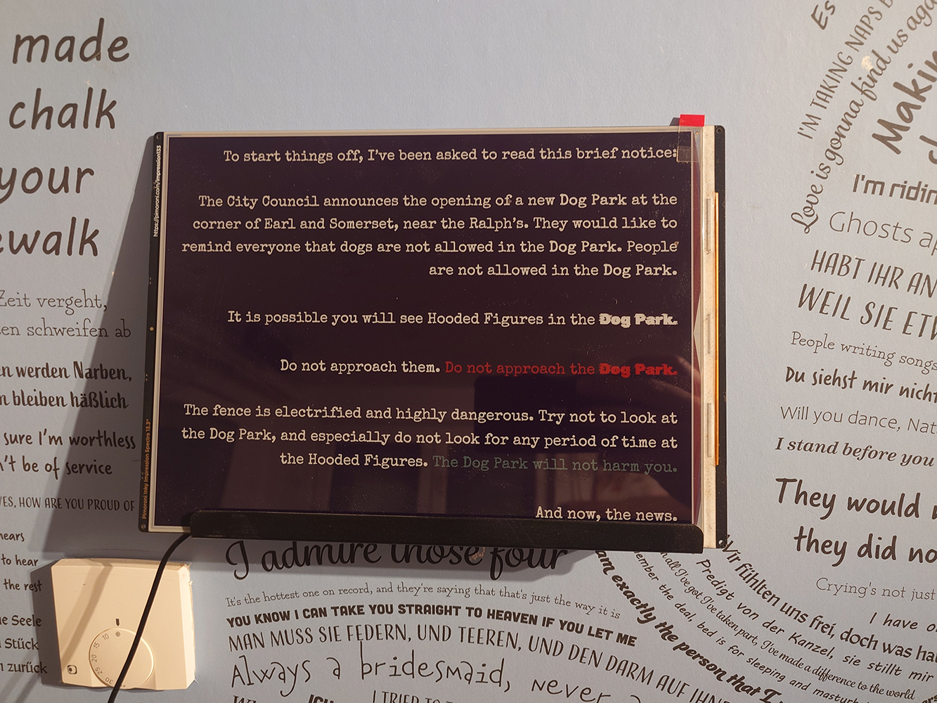
A paragraph from the first episode of Welcome To Night Vale, typeset with the layout tool
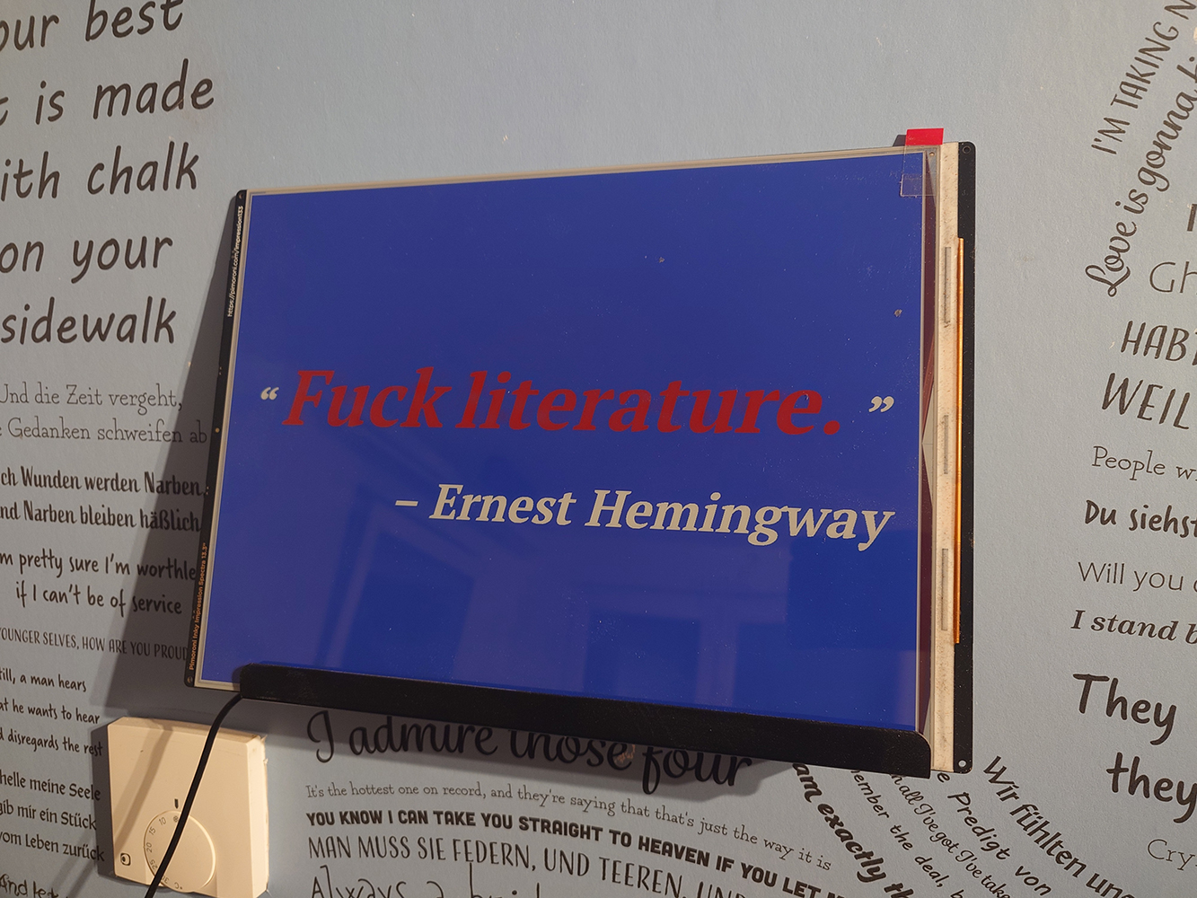
“Fuck Literature”, a quote by Ernest Hemingway, typeset with the layout tool
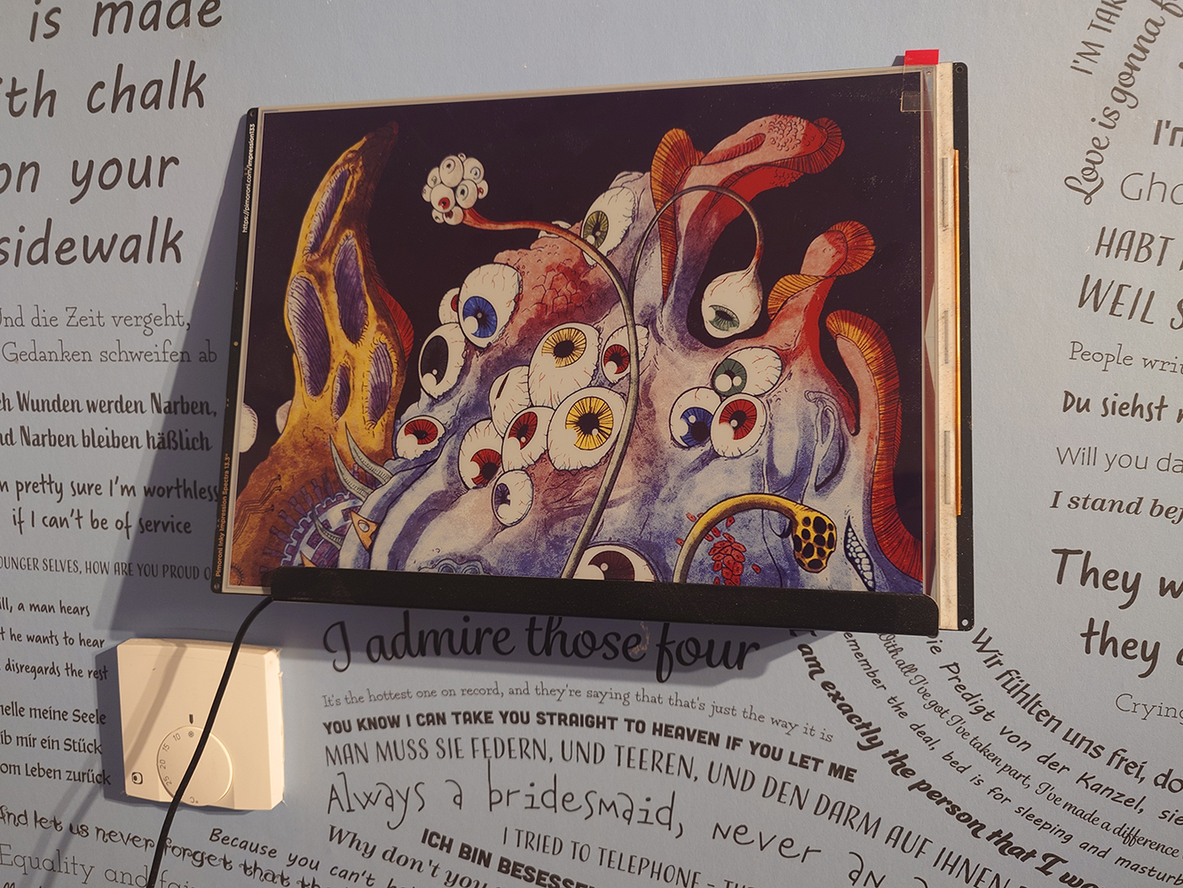
An illustration from Gunnerkrigg Court, an excellent webcomic
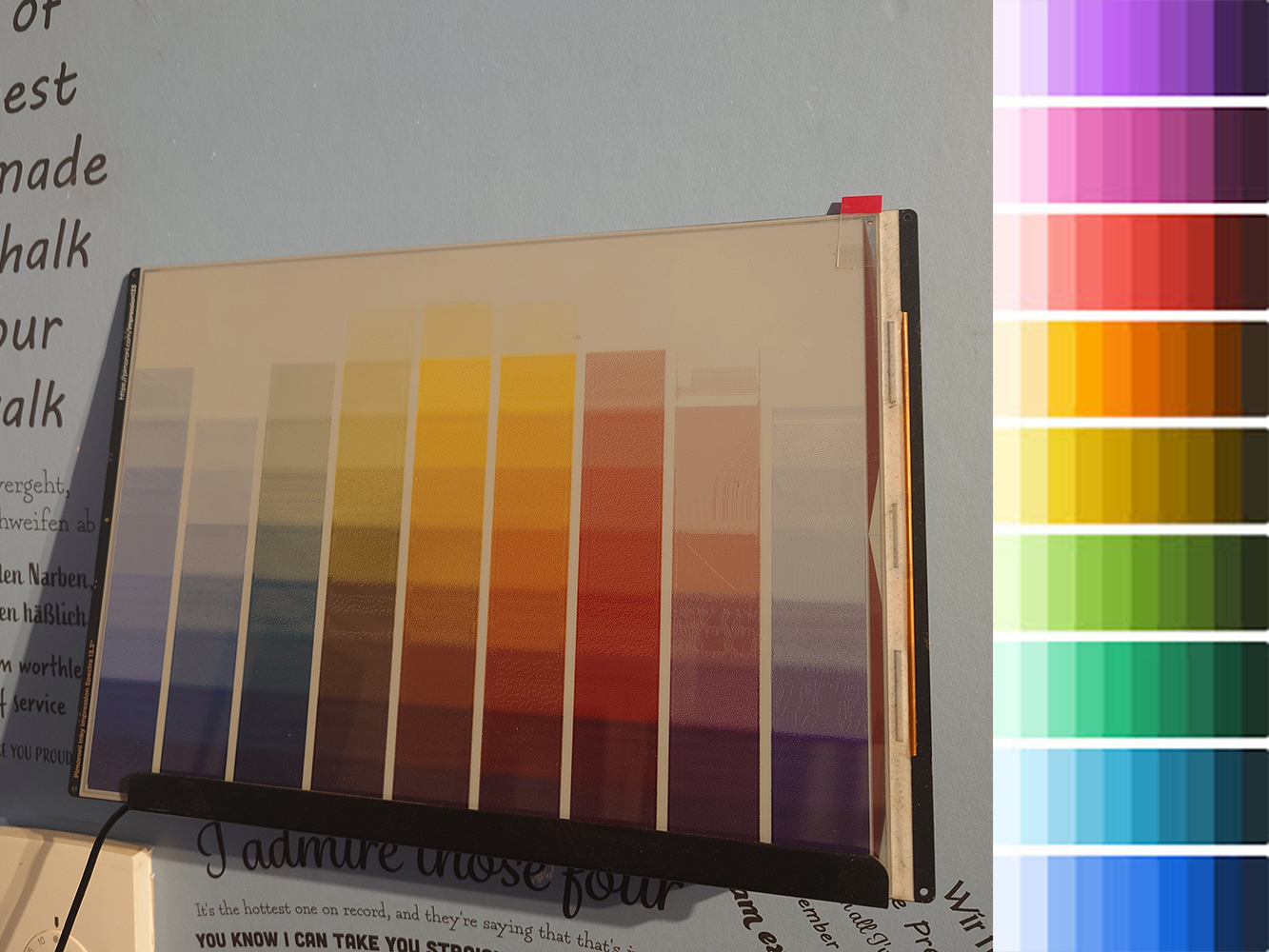
A color chart, showing that dark colors are displayed more reliably thanlight ones
That’s all, thanks, bye!
I ended up needing to create a basic color mapping, with one set of RGB colors for displaying on the web frontend mapped to a different set of RGB values to actually get a perceptual match on the e-ink screen. Telling the screen to show █████ results in a color best approximated by █████. ↩
A full RGB color picker was rejected because it was too easy to get unpleasant results with the dithering - especially since access to the full color space made perceptual color matching much harder. The dithering algorithm works great on gradients and saturated/dark colors (I’ve managed a beautiful rich purple), but struggles with light pastels. ↩